Beacon Crossing Brand Development
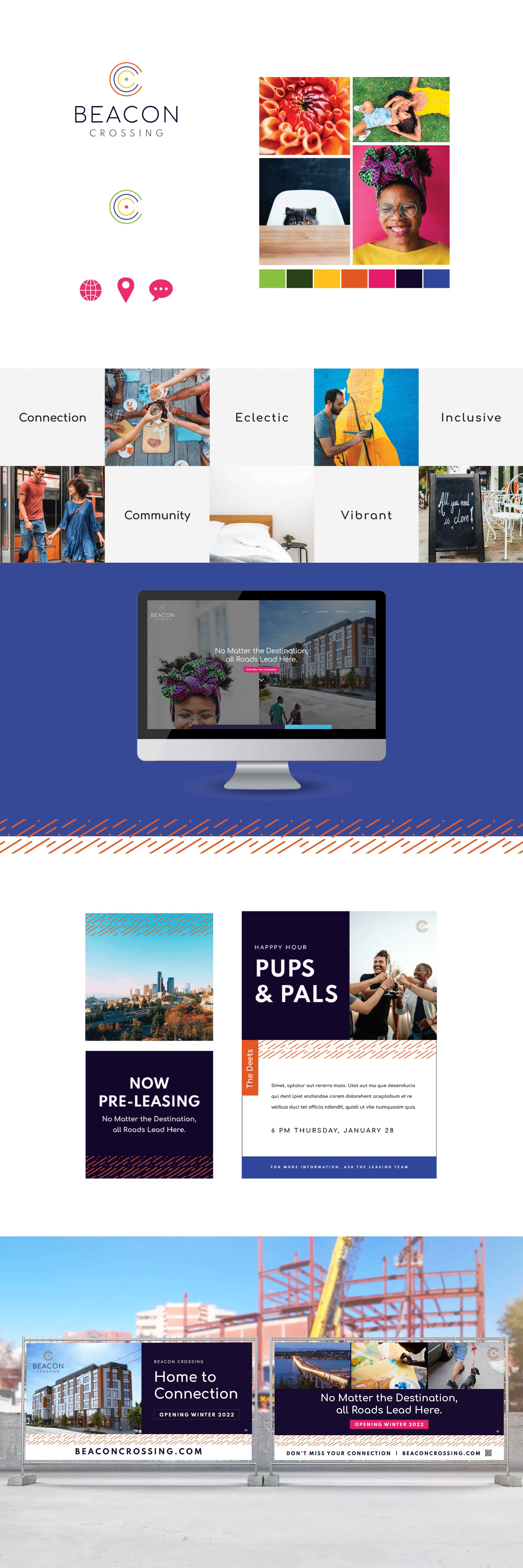
The Beacon Crossing brand was built around the idea of fostering community and connections. The project is located in Beacon Hill, which celebrates a diverse community surrounded by parks, businesses, and restaurants. We wanted the brand to be eye-catching and refreshing as a new project in the area.
The logo is inspired by radiating connecting and implied movement. Shaped somewhat like a “C” and somewhat like a signal channeling all people to come here, it further supports the words “connection” and “crossing”. Our brand colors are unique, vibrant, and bold just like the community it resides in, and the curated stock photo enhance that even more for a cohesive visual story.
Creative Director: Danielle Elliott
Graphic Designer: Makayla Virden
Splash Page Design: Makayla Virden
Stock Photos Sourced from Stocksy, Unsplash, and Pexels.
