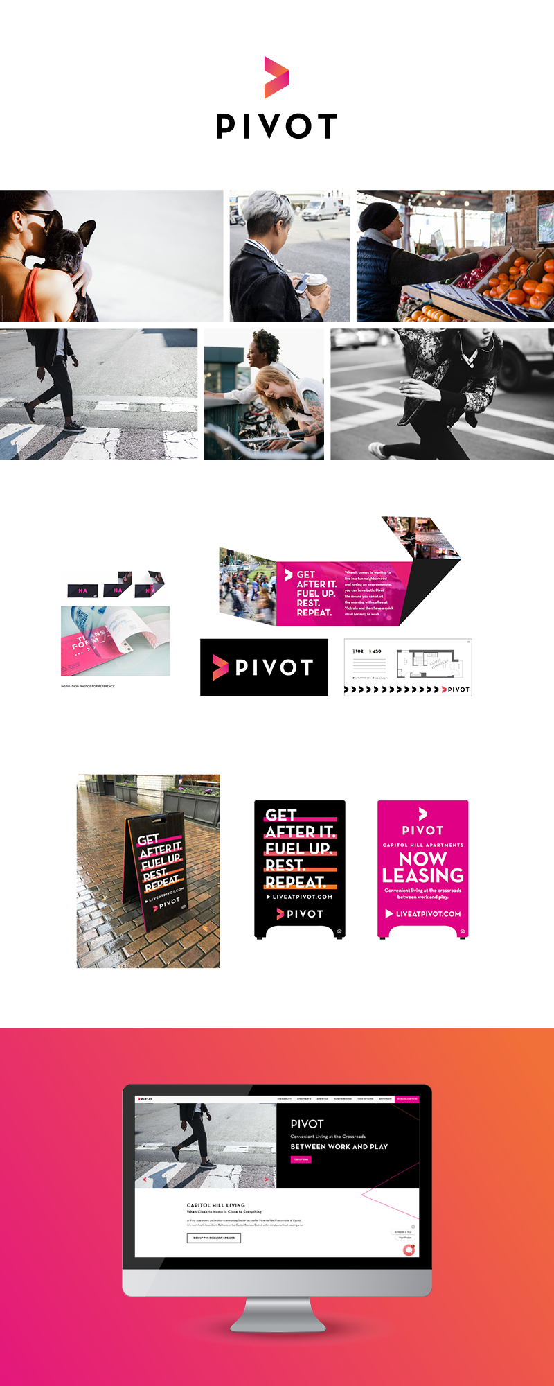
Bold & Bright Brand Development
Pivot isn’t your typical brand, it’s full of color with bold pinks, oranges, and outlined shapes. The simple typeface of the primary logo matched with a gradient arrow to direct your way here. The imagery of Pivot is curated to be harsh blacks with pops of color to contrast our gray-scale. Overall, this brand stands out in the Downtown Seattle landscape.
Creative Director: Danielle Elliott
Graphic Designer: Makayla Virden
Website Design: Makayla Virden
Stock Photos Sourced from Stocksy, Unsplash, and Pexels.
